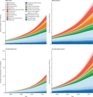
Last year, a network of health scientists from around the world set out to create the most comprehensive portrait of world obesity ever produced. The researchers compiled results from 1,698 studies on adult obesity, covering 186 countries, 19.2 million participants, and spanning 40 years. And they condensed it all into a single study, published earlier this year in the Lancet medical journal.
And here are the full results, presented in one eye-opening graphic.
The colour of each country represents its adult obesity rate in the year shown. Hover over a country to see what its obesity rate was in 1975 and what it is today.
Since 1975, obesity rates have risen in every country in the world, without exception. That includes countries like the United States and the UK, where food is cheap and abundant, and countries like Somalia and Angola, where malnutrition remains an epidemic.
At the low end, North Korea’s obesity rates are up about 1% (from 1.6% in 1975 to 2.8% today). Japan is also near the bottom with a 2% increase since 1975 (from 1.1% to 3.3%). The largest changes occurred in smaller Pacific island countries. Samoa, Tonga, and Tuvalu all saw their obesity rates increase by more than 20%, a doubling of what they were in 1975.
Perhaps the country that stands out most of all is China. In 1975, only 0.5% of Chinese adults were obese. Today, China’s obesity rate is about 8%, a 16-fold increase in the most populous country in the world.
Globally, the average adult today is three times as likely to be obese compared to the average adult in 1975.

Few other problems exhibit such a clear trend, over such a long time frame, across the entire world. In fact, I created this map because I think the magnitude of the global obesity epidemic is difficult to communicate with statistics alone.
However, the map also illustrates another point about a completely different topic, one that is even bigger and further reaching than global obesity – the problem of information overload.
The digital universe is growing exceptionally fast. Half of the information available online today was created in just the last two years. But for that information to be useful to anyone outside of subject matter experts, it must overcome a host of challenges.
First, the information must be practically accessible. This obesity study represents the work of thousands of researchers over perhaps millions of hours. Data visualisation, reduces it all into an intuitive, easily-digestible graphic.
At the same time, data visualisation gives us a frame of reference for understanding what would otherwise be cold, abstract numbers. When you read statistics about obesity, either as written language or as tables of numbers in a spreadsheet, you realise obesity is a problem. But when you watch the story unfold visually, you can feel the depth and magnitude of the problem because you are witnessing it firsthand.
Finally, for the information to be useful, it must be discoverable from among an ever-growing sea of digital noise. Data visualisations are not only informative, they can also be fun and beautiful, something that people will want to share with their friends.
As the digital universe continues to grow, making sense of all that information presents an increasingly difficult challenge. Fortunately, it may have an easy solution: communicate it visually.
How the world got fat: a visualisation of global obesity over 40 years | Max Galka
Hiç yorum yok:
Yorum Gönder